Branding & Packaging
Lunaume
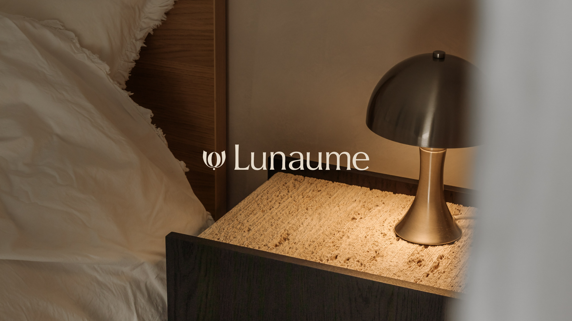
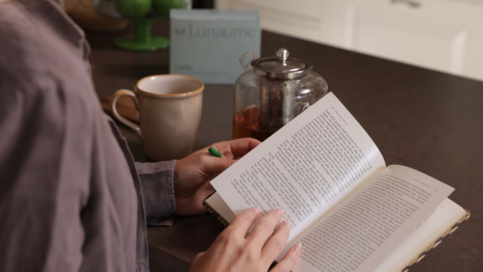
Lunaume is a premium wellbeing brand entering the market with high-quality supplements for women aged 30 to 55. Created for women with full lives and high standards, who consciously choose quality in everything they do. From their daily routines to the products they surround themselves with. With Lunaume, founder Narjiss brings a fresh, refined and slightly rebellious perspective to women’s wellbeing. Drawing from her own experiences, she believes in a more personal approach to wellbeing, with thoughtful, intelligently developed products that work with the natural rhythms of the female body and fit effortlessly into busy, multifaceted lives.
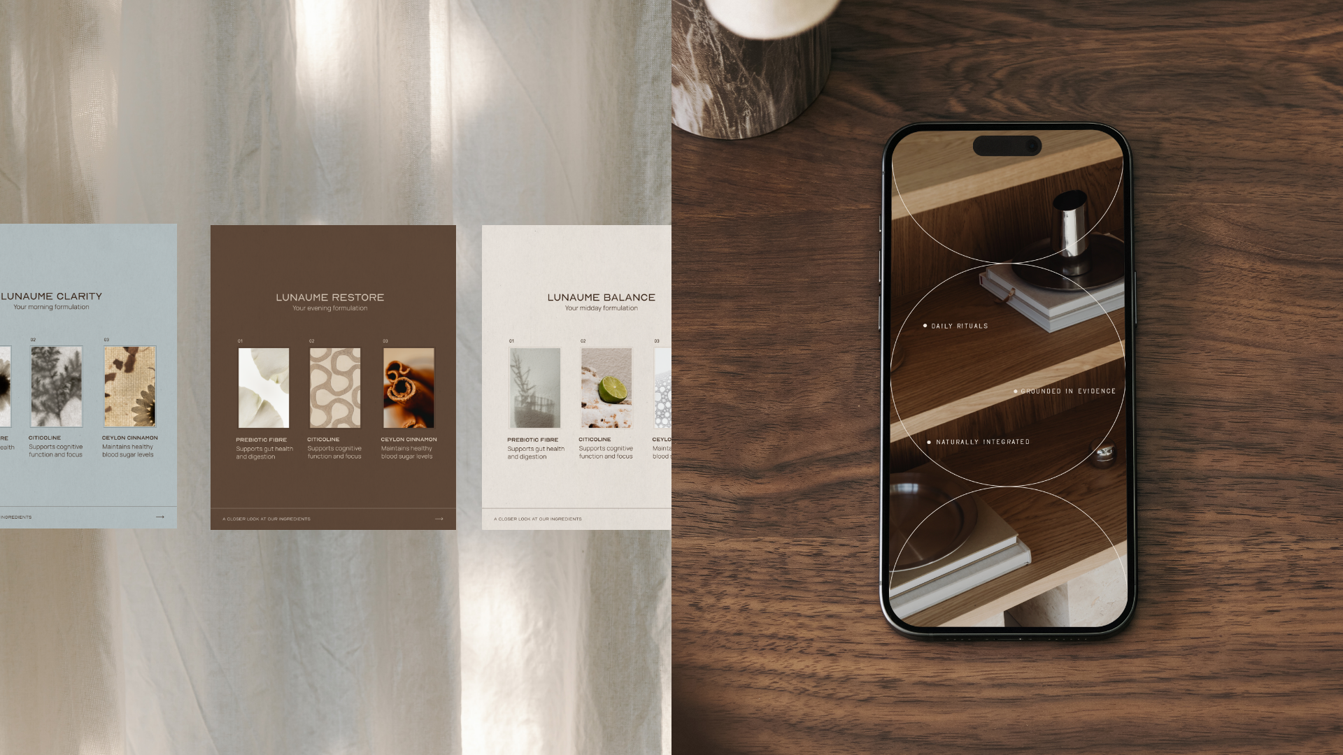
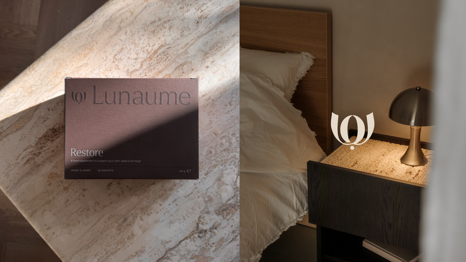
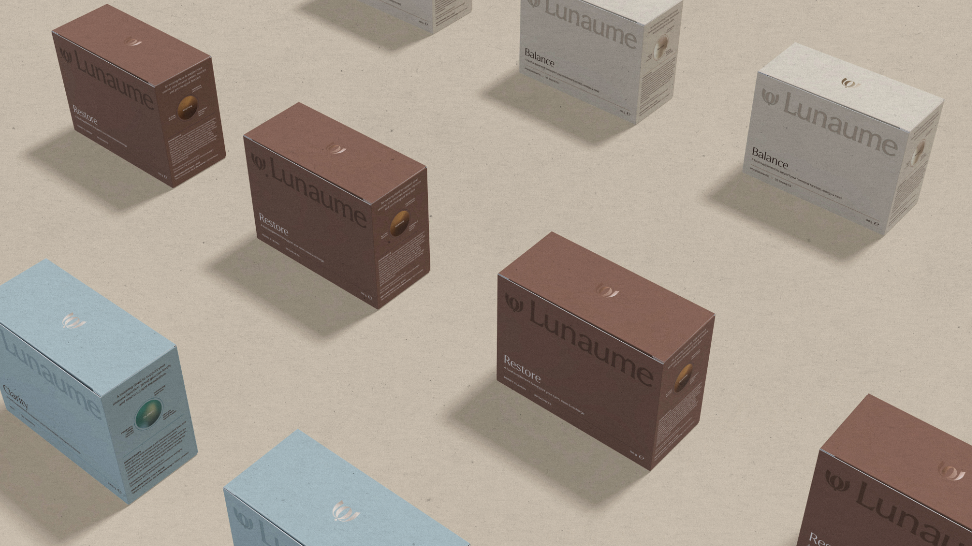
The first collection introduces Clarity, Balance and Restore, three supplements designed for different moments and needs throughout the day. Together with Narjiss, Studio NNK developed the brand strategy, visual identity and packaging design, creating a brand that combines the credibility of science-backed wellbeing with the appeal of a premium lifestyle brand. Built with ambitions that extend far beyond its first product collection.

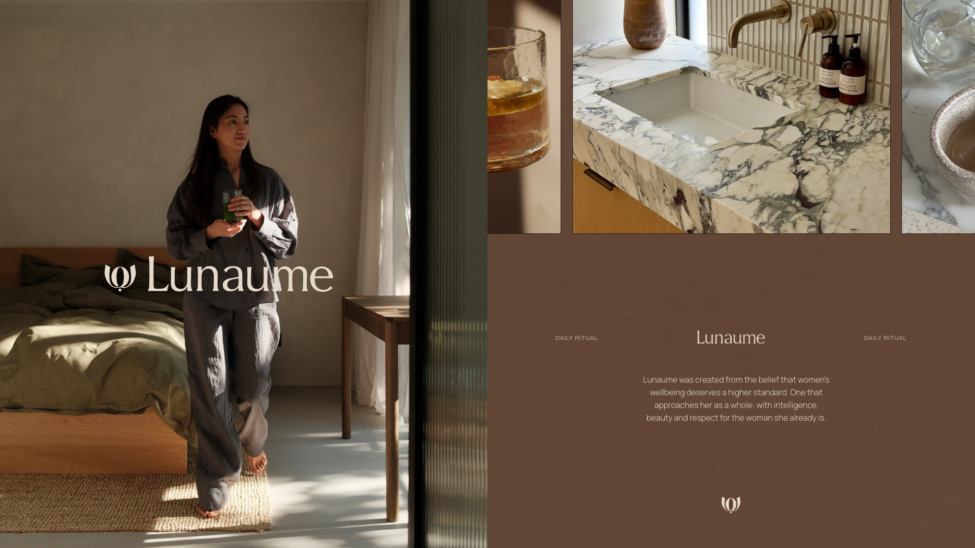
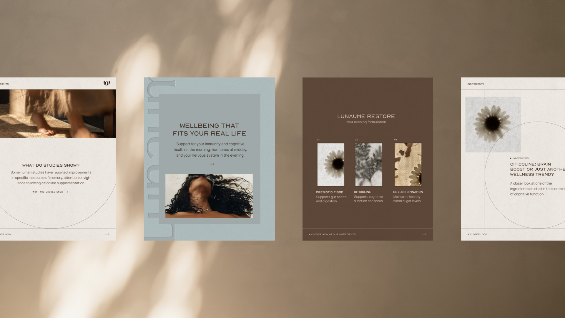
In a saturated wellness market, where many brands follow the same visual codes and make similar promises, the challenge was to establish a distinctive position that would resonate with a mature, discerning audience.
We explored the market alongside the mindset, lifestyle and expectations of these women, looking at what they truly value in a premium wellbeing brand. Bringing together informed expertise and the appeal of a lifestyle brand, we shaped a brand personality that feels refined and confident, yet warm and approachable.
At its heart is a fresh perspective on wellbeing. One that moves away from the constant pressure to improve or fix yourself, and instead focuses on understanding and supporting your body's natural rhythms.
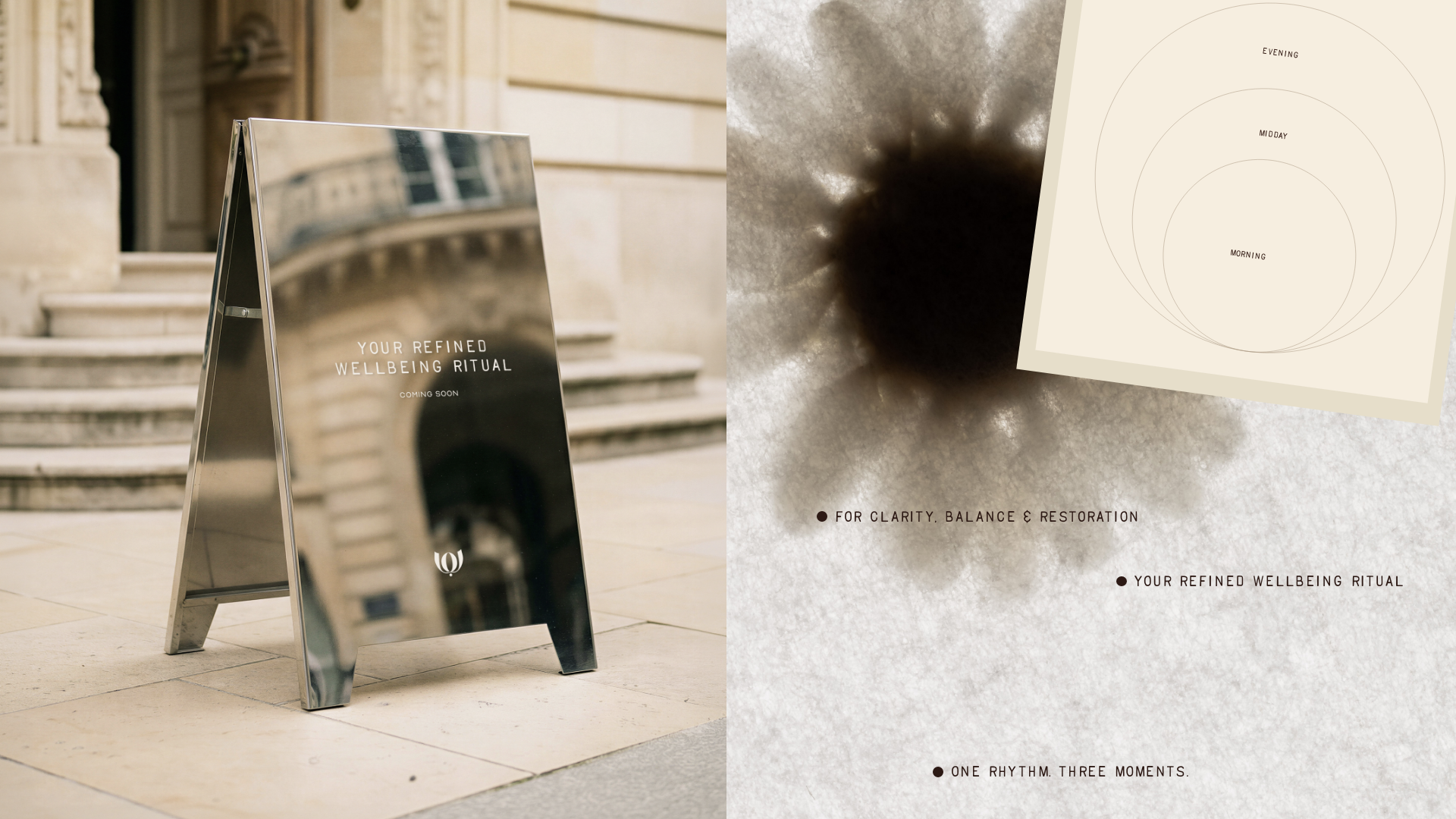
Rooted in the brand strategy and its three core pillars, Clarity, Balance & Restore, we developed the creative direction Rhythmic Rituals. A concept that brings together natural rhythms, daily rituals and a sense of structure, forming the foundation of the visual identity. From the changing phases of the day to the cyclical nature of the female body.
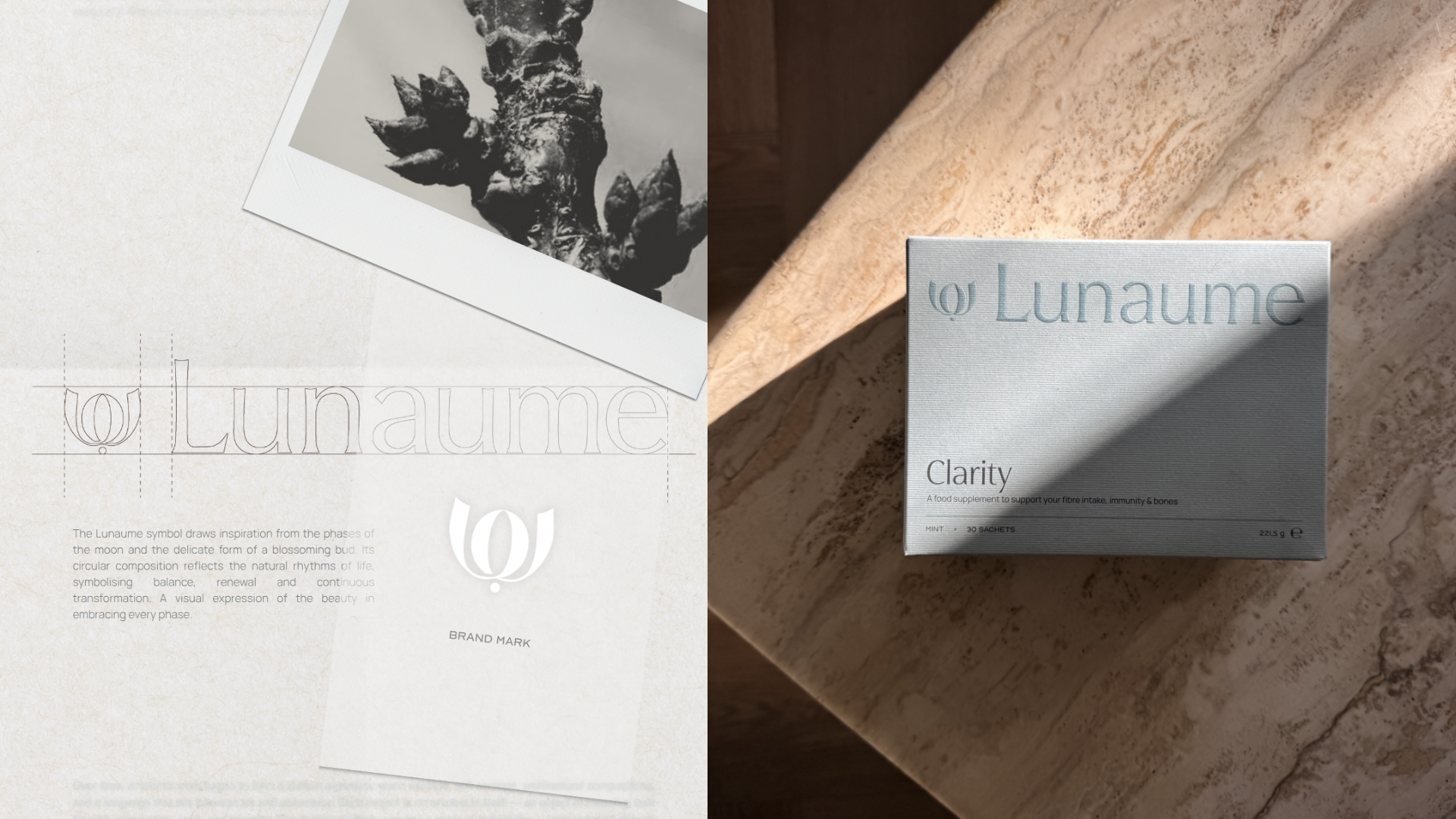
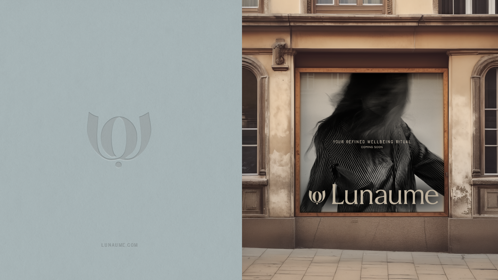
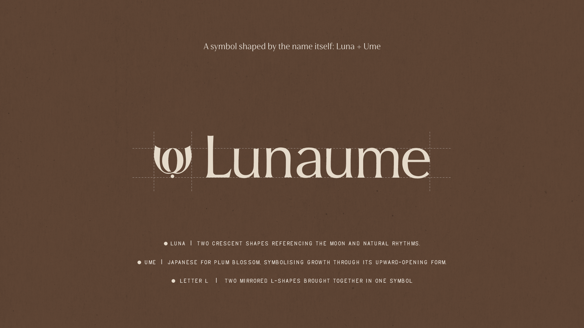
The custom wordmark features elegant, flowing letterforms. The brand symbol brings together multiple layers of meaning, drawn from the name Lunaume itself. Two crescent shapes reference Luna, the moon and its natural rhythms. Ume refers to the Japanese plum blossom, a symbol of growth, reflected in the upward-opening shape reminiscent of a flower bud. At the same time, two mirrored L-shapes come together to form the symbol. Rounded forms, grids, lines and dots carry the concept through into a distinctive graphic system.
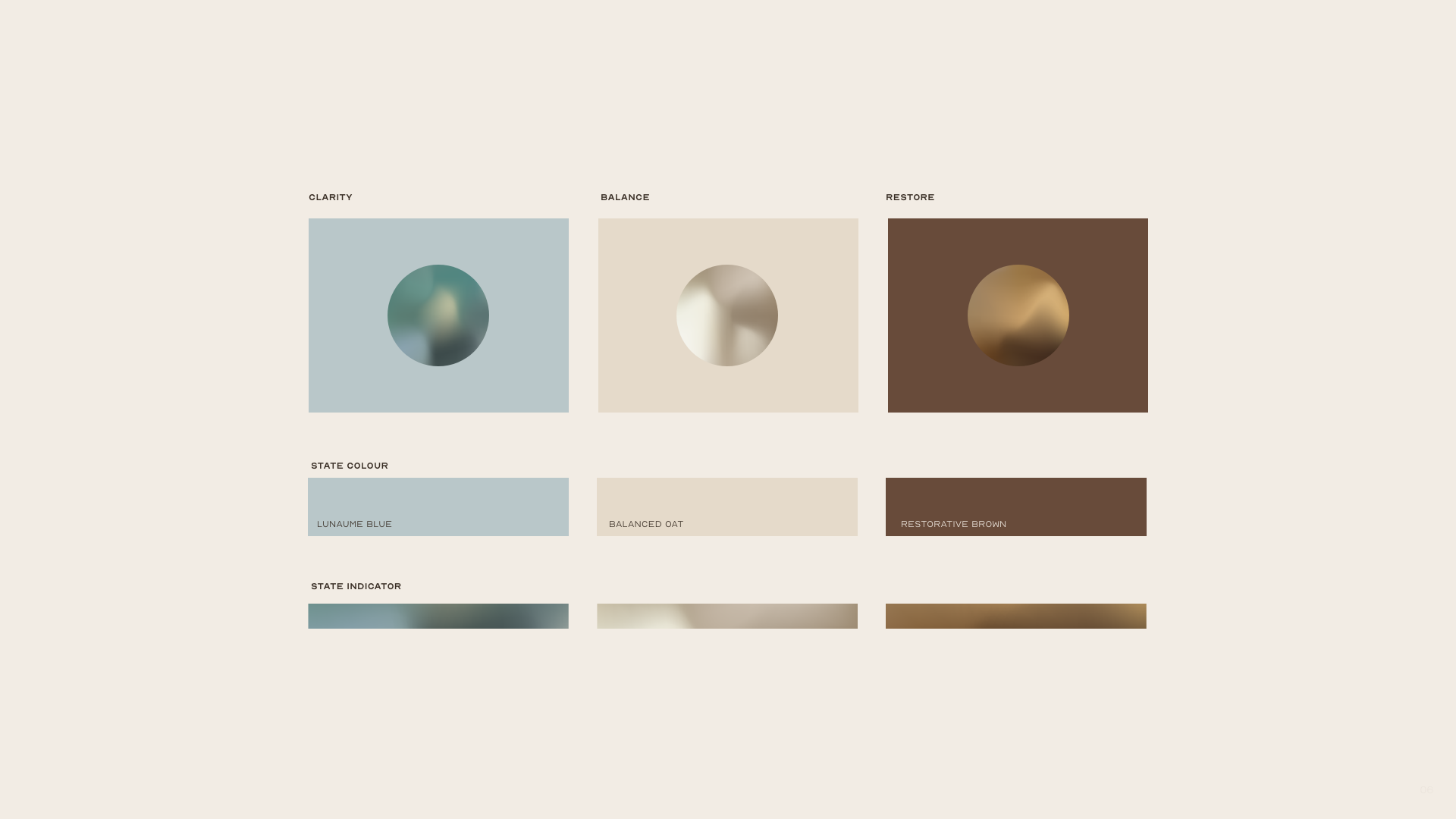
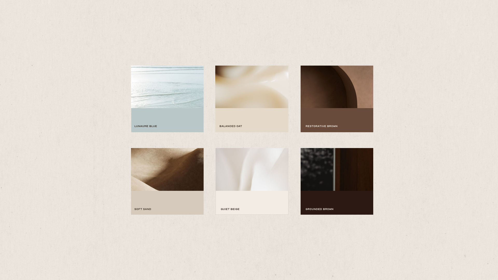
The colour palette reflects this same sense of rhythm. Moving from fresh, refined Lunaume Blue to balanced beige and a calming deep brown. Each colour is connected to Clarity, Balance & Restore, giving each pillar its own character within the wider brand identity. Together with the typography and graphic elements, they create a cohesive, refined brand world designed to evolve alongside Lunaume and expand into future product categories.
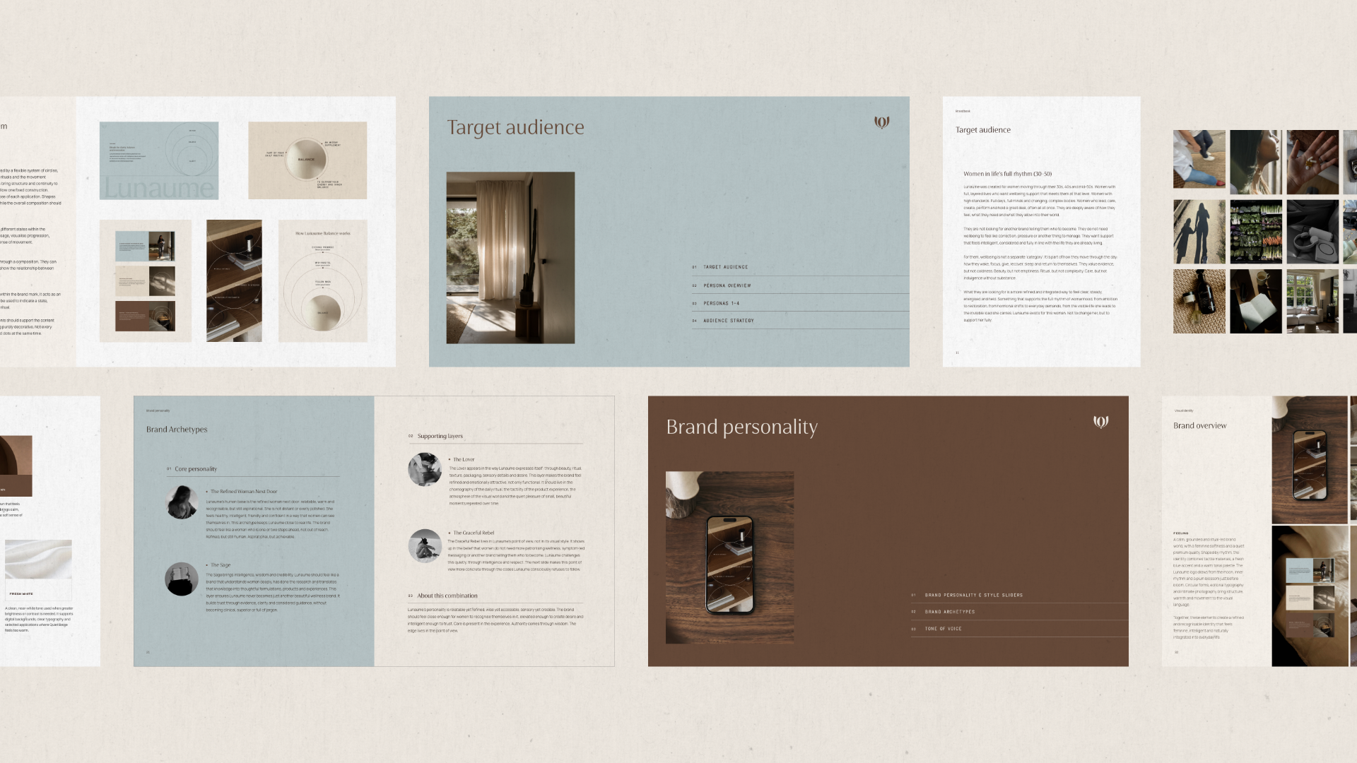
Brand strategy — brand story, vision & mission, brand values, target audience research, competitor analysis, brand personality, tone of voice & messaging architecture
Creative direction — overall brand look & feel, visual direction & photography direction
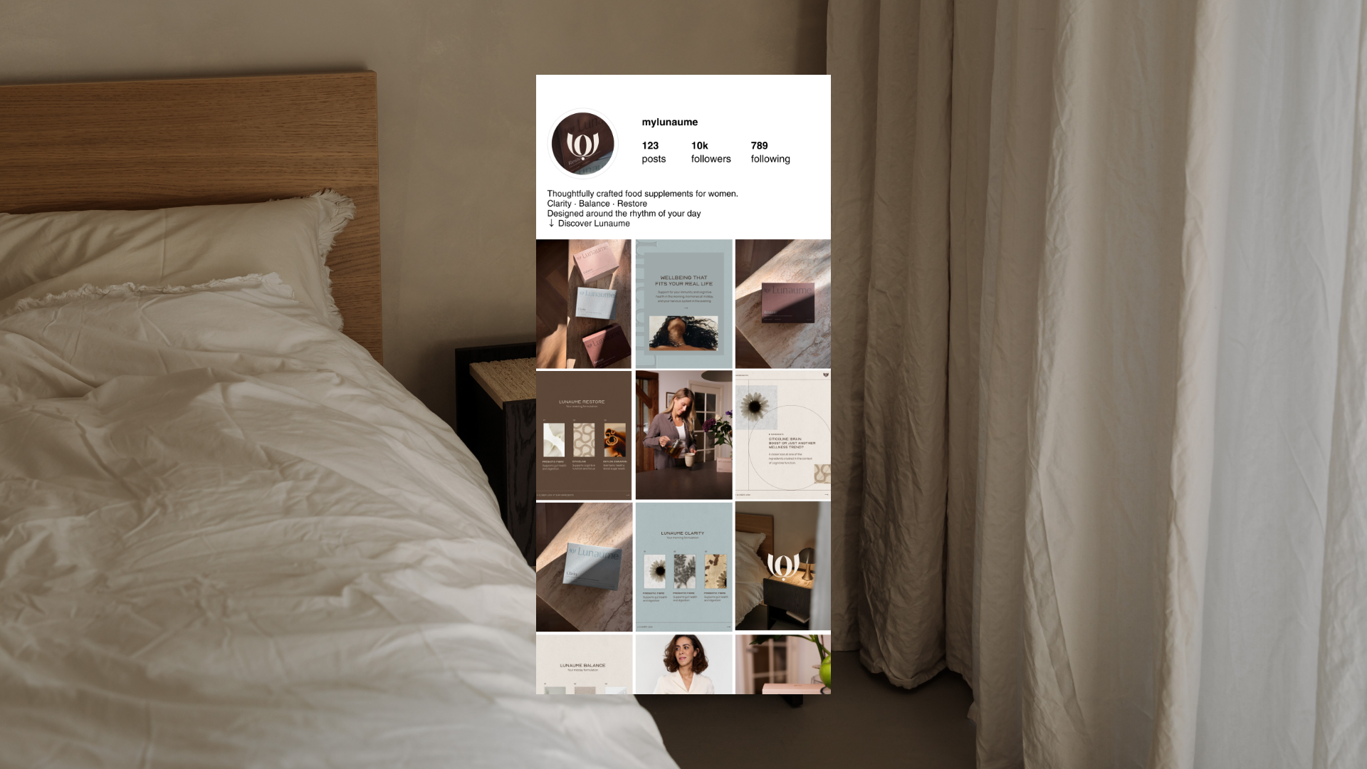
Visual identity — custom logo system, colour palette, typography, graphic system, social media direction & templates, brand book & guidelines
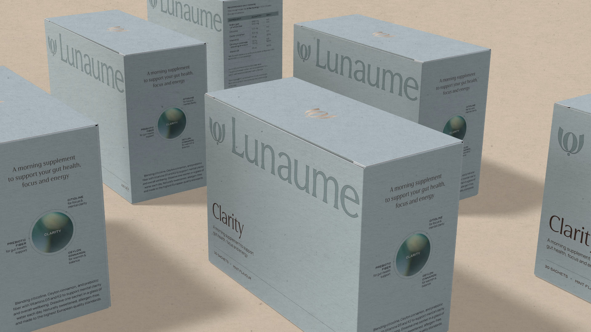
Packaging design — packaging system for Clarity, Balance & Restore, sachets, shipping box & unboxing card design